Skip to content

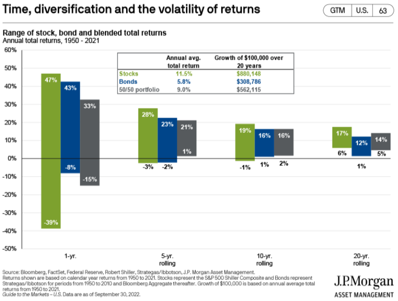
Today’s chart from JP Morgan Asset Management’s Guide to the Markets quarterly presentation shows the cumulative returns based on 1, 5, 10, and 20 years for all stocks (in green), all bonds (in blue), and a 50/50 mix (in grey) since 1950.
Essentially, the longer you hold your investments, the higher probability you have of positive returns. In fact, there was never a period over 20 years that any of the options lost money.
The chart also shows the average annual total return for stocks was an impressive 11.5% during last 20 years. It will be interesting to see how the next 20 years look.

Samuel serves as Senior Vice President, Chief Investment Officer for the Crews family of banks. He manages the individual investment holdings of his clients, including individuals, families, foundations, and institutions throughout the State of Florida. Samuel has been involved in banking since 1996 and has more than 20 years experience working in wealth management.
Investments are not a deposit or other obligation of, or guaranteed by, the bank, are not FDIC insured, not insured by any federal government agency, and are subject to investment risks, including possible loss of principal.
